Google sheets is a complete productivity tool, since you can use it for various purposes: such as databases and even presentations. With countless possibilitiesand resources, the function that every beginner needs to know is how to create a basic chart.
The graph is the best way to show numerical values or data visually, which makes them easier to understand. There are several types of charts on Google sheets and the most used are:
- Column (or bar) chart: the most popular, it is used mainly to show data changes in a certain period or to make comparisons.
- Line graph : ideal for illustrating and controlling changes over time and facilitating the identification of trends or problems.
- Pie chart : it serves to show individual or proportional values that together result in the total value of 100% of the displayed data. This is useful if you want to make a pie chart online.
- Scatter plot : works like a diagram to indicate the existence of variables or intensities.
Microsoft also offers an online version and free of Excel, but this version has some limitations that end up making Google Docs a more complete alternative. However, in terms of interface, the web version of Excel far outweighs Google Sheets.
Read: Best photo editing software for PC
How to create a basic chart in Google sheets
A graph is formed by two axes called X and Y. The Y axis is where the coordinates or categories are, while on the X axis are the values. Whenever information from each of these axes has been gathered a graph can be generated.
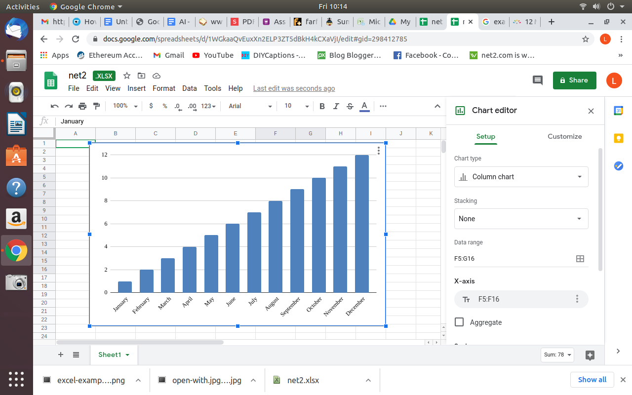
All you need to create a basic chart is information or values that can be arranged side by side, each in a different row and column. See the example below in which you find the months along with their corresponding numbers.
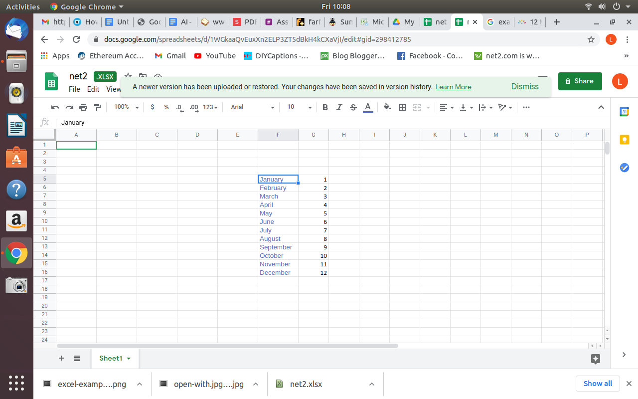
Now, with the mouse, select the Y and X axes, including the origin point that separates the values, which is nothing more than the square between the columns that will be left without information.
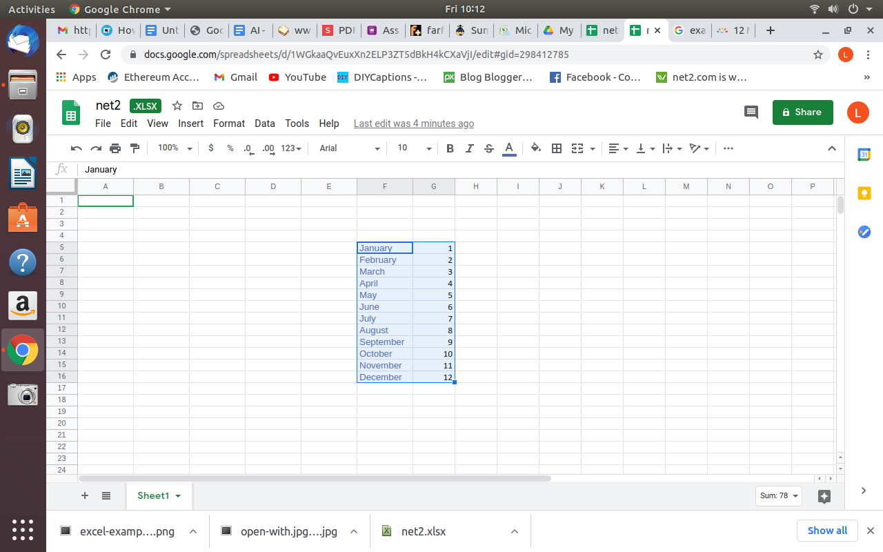
With the data selected, go to the “Insert” tab and select the desired chart type.
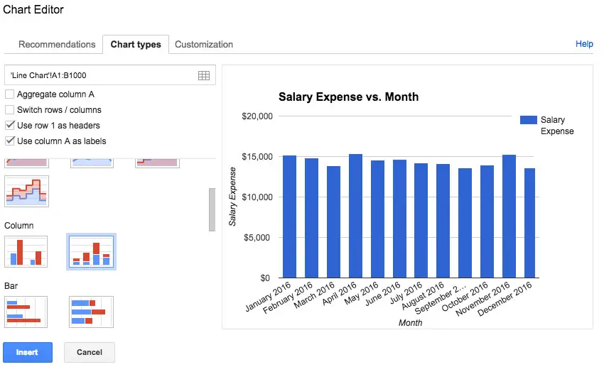
Google sheets charts types | Google sheets graphs types
Once you select the chart type, Your chart will be rendered immediately. To update the chart, simply change the values you entered. Remembering that you can insert as many rows and columns as you like, as long as they are positioned as shown earlier.
Read: How to Google search from Linux terminal. Build your own search engine
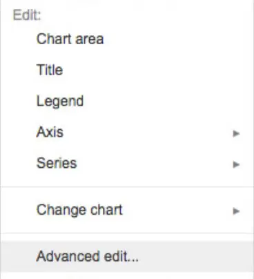
To customize the chart you have assembled, for example to change the title or the presentation style, simply right click on the mouse and click on ‘Advanced edit” option:
If you like the content, we would appreciate your support by buying us a coffee. Thank you so much for your visit and support.

